Wednesday, August 7, 2013

Day 3: Photoshop Elements for Flashcards & Organizing

 
Welcome to Hump Day in our 5 Days Of….. blog hop.  As parent/teachers we know that homeschooling isn’t always great, messy experiments in the kitchen or field trips to the Children’s Museum.  A lot if it is knowing which box holds the extra index cards and glue sticks or having a way for kids to know their assignments without constantly asking you “What’s next.”  In the same way Photoshop Elements isn’t always altering images to make it look like I’m standing on the Great Wall of China even though I’ve never traveled to the country.

A picture may be worth a thousand words, but sometimes you just need to add words to or in place of the pictures.  And believe it or not, this photo editing software can do a lot to make words pop. One word of caution—it cannot spell check or notify you of grammar errors the way a word processor can so proof read, proof read, proof read.  Today we’re going to cover some of the basics of the Type tool and how we can use it to make labels and bookmarks, flash cards, etc..


The Type icon looks like a capital T in the toolbar type icon.  If you right click on it you can see all the sub menus.
 

In most cases I simply use the Horizontal Type Tool—this allows me to type on the image from left to right just like word processing—although it will not “wrap” text when you come to the edge of the image, you must hit the enter key to start a new line.   We also have access to all the fonts on the computer.  With the Text tool active you can see an options bar like this. 


The first drop down menu allows you to select your font family.  PSE has a nice feature letting you see a sample of the font next to the name but the default view (like the picture above) makes the letters so small it’s nearly impossible to tell one font from another.  You can fix that by clicking Edit>Preferences>Type.  When the Type Options window pops up change the Font Preview size to Extra Large or Huge if you need it and click OK.


The second drop down menu allows you to select different styles of your font family—condensing the letters, adding italics or boldness.  The default will say “Regular.” Not all fonts have these styles available but you may still be able alter their appearance with the Faux buttons (all with the letter T in different styles). If the font family you’ve selected doesn’t come with bold type or italics, Photoshop Elements can create a fake one for you.

The third drop down menu is font size.  Pick something you believe is close to your needs, but you can always make your text larger or smaller by switching to the move tool and dragging at the corners of the text layer.

The box with the two A’s has to do with keeping the letters from looking too pixelated at larger sizes.  It’s official name is Anti-Aliased.  The default setting is on.  Do yourself a favor and leave it that way.  The next drop down menu with the lines lets you pick left, center, or right justification of your text.  The icon with the two A’s on top of one another let’s you select the spacing between lines of text. 

The last icon we’re going to worry about today is the color box.  Click the down arrow once and you’ll see a selection of standard colors.

Click on the box that says more colors and a new window opens.
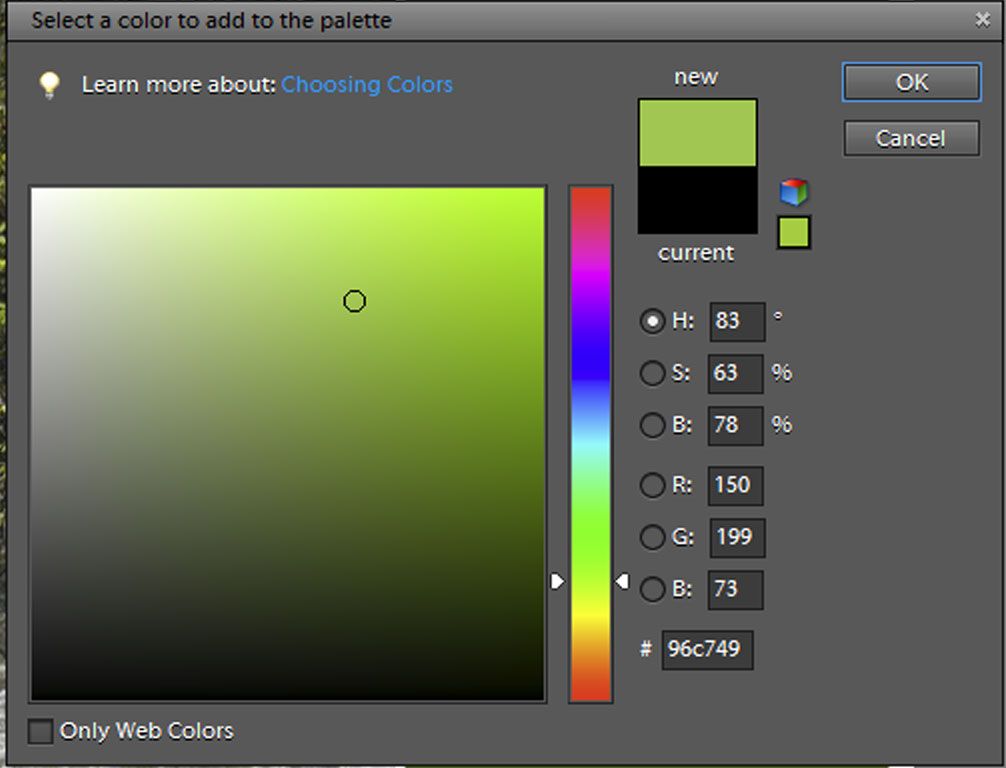

 
If you hold your mouse over the rainbow column and click you’ll bring up all the hues of that color in the large square (I’m obviously in the green family).  When you hold you mouse over the square a circle will appear and you can click to select your color.  On the other hand, if you’re trying to match a color in a picture hover the mouse over the image itself.  It will look like a little medicine dropper.  When the tip of the dropper is over your desired color left click the mouse to select it.

play-with-font

Now let’s see some type tools in action.  This week I’ve been making flash cards for our upcoming history lessons.  I start with a blank new file 2.75 X 3.5 inches in size.  I’m going to use the horizontal type tool, but I don’t want the words to scroll off the page in a straight line.  After selecting the type tool, but before I begin typing I click and drag the mouse from the top left corner to the bottom right corner over the white background.  This creates a bounding box so what I type will automatically wrap around to a new line when it reaches the edge.  You can choose if you want the text justified to the left, right or centered in the box.


After I typed the historical information in, I dragged this the thumbnail of this box onto a larger 8.5 X 11 background.  Doing this makes PSE treat it as an image not a text box so I won’t be able to edit what I’ve written.  I move the box where I want it on the page and I outline it by choosing Edit>Stroke (Outline) Selection.  I can fit 9 flash cards on a page (notice that I kept the center open till last because images dragged onto files always appear dead center).

Explorer-match-up-cards-2

In this particular case, I’m making flashcards for a Memory type matching game so the other side will remain blank.  If I wanted to put the portraits on the reverse side I would flip my image over Image>Rotate>Flip Horizontal to ensure an exact mirror image when printing and then I would arrange the pictures over the backwards text.

Let me show you some of my other projects where Text features a prominent role.
new-workbox-labels
We organize our school materials in Workboxes, but rather than label them with numbers I keep one specifically for every subject with a spare one for pencils, glue sticks, index cards etc. 

I begin with the Shape tool to make rectangles and fill it with Gradient tool color (I can see I’ve got more than 5 days worth of Photoshop Elements to share—maybe I’ll start a weekly tutorial).  Then I added my pictures and text. 

Normal fonts can only get so big before they start to appear pixelated.  If you need really big letters you may want to try an Alpha set.  In this case each letter is it’s own  high resolution .psd file and you can resize it just like a picture without it appearing to blocky.  (There’s another future tutorial).

bookmarks
I always make a set of bookmarks for each subject as well.  Not only does it help us find our place in each book, each day but I laminated them so I can write each day’s assignment on them in case I’m not available when my son finishes one subject and is ready to move onto the next. 

Although the words appear down the length of the side, this is not an example of Vertical Type. I typed the words “Today’s Assignment” using the same Horizontal Type tool and the rotated the words with the Move tool. 


We’ve just scratched the surface of the Type tool.  Adding text on a shape or following a custom path (a new feature of PSE 10 and above) helps make great mini-books for lapbooking.  Speaking of lapbooks, that’s the subject of tomorrow’s tutorial so you’ll want to check it out.  Have you learned anything new this week?  Do you have any ideas for future tutorials?  Leave a comment.


Click on the image below to see what other Crew Members are sharing.

Summer Blog Hop

Tuesday, August 6, 2013

Day 2: Photoshop Elements for Record Keeping


Yesterday we used a Quick Page to plop three pictures into a page that someone else had designed.  We could have changed the colors of the Quick Page but not any of the decorative elements or the placement of the features.  Today we’ll be going a step further…by using a Multi-Layer Template we can choose the Digital papers and elements we want on the page, we can move things around and delete things we don’t need.  Digital Scrapbooking is one of the greatest uses for Photoshop Elements.  No more running to the craft store for papers, stamps, stickers, etc.  You can customize colors and sizes of all the digital elements—and you can find PLENTY of generous crafty souls who offer what they’ve made FREE on the internet. 
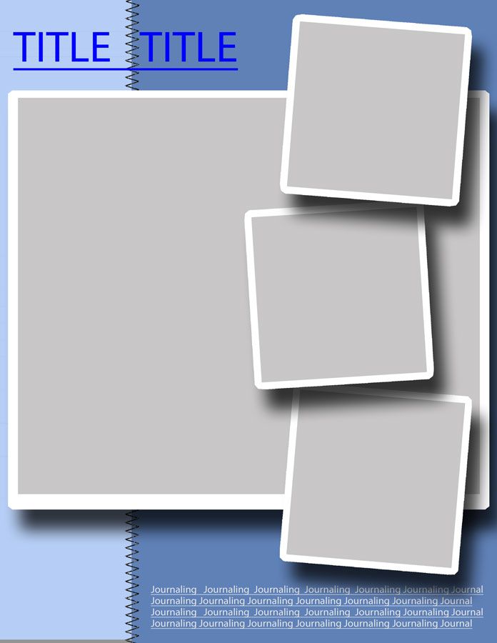
For today’s lesson, I’m giving you a gift—a template I made myself so you can practice along with me--5 Days of PSE for School Template.psd Rather than make a kit of papers and elements, I’m going to direct you to ComputerScrapbook.com where everything is FREE.  If you want to follow my directions exactly, I’m using the Home of the Brave Kit.   Just add everything to your cart, you won’t be asked for any financial info when you check out.  Then download, save and unzip all the files.  By the way, digital scrapbooking can take up a lot of memory so you may want a 32 K thumb drive or an external hard drive if you start accumulating kits.


 If you do start amassing digital scrapbook files, you may also want to take advantage of PSE’s organizer feature.  I have a catalog devoted to digi-scrap and I tag everything by kit, by color, and what each item is (template, paper, alpha set, etc.) so I can search for specific items.  If you want to know more about that, I suggest getting a copy of Photoshop Elements: Basics and Beyond by Patty Debowski (it’s geared towards the digital scrapbooker).  If you buy the book you’ll get a CD full of digi-scrap kits and a file with all the tags to sort them by.


In this case we don’t need to start with a new Blank Page,  the background and all the sandwich layers have already been set up in the template. When you buy a layered template or download a freebie, you may actually receive several files e.g. a preview of the template in a .jpeg format.  You want to open the file with a .psd at the end.   Important:  As soon as you open a template, save it under a new project name! (choose File > Save As)  If you just use Save when your work is finished you’ll have lost your blank canvas for future projects—guess how I know this.. 
 
You’ll also want to open files for the digital papers, embellishments and journaling tags you want to use in the project.  You can either use the File >Open command in PSE’s Editor and browse to find  where your digi-scrap elements are stored or you can click on images in PSE’s Organizer (hold down the Ctrl and click to select more than one) and choose Fix > Full Photo Edit in the Organizer’s upper right corner.  I’ve circled the elements I’m going to use. 


Now we’re going to start  coloring/covering each layer using the same technique over and over again (since layered templates have plenty of layers, you get lots of practice). 


With the layered template active in the work area, start by highlighting the background layer in the Layers panel.  Then choose your Move Tool from the toolbar on the left.  Click and drag  the digital paper you want for your background (I’m going with the neutral tan paper) up to the work area.  Because we’ve started at the bottom it will already appear beneath all the photo spaces and mats. You may have to move the paper to cover the entire background.  Click the green check mark when you’re done.


Moving from bottom to top, we’re now going to change the Paper 1 layer so highlight it in the Layers panel.  Then click and drag the next paper up to the work area (I’m using the red patterned paper).


Uh, oh.  Not only did it cover the Paper 1 area, but our nice tan background too.  We could resize it to fit by dragging on the squares at the sides and corners like we did yesterday, but that might really distort the patterns on some papers.  Instead, we going to use a Clipping mask technique.  With the paper we want placed just above the layer we’re coloring, we just hold the Ctrl button and press G. 


Now our red paper is confined to the space we want and in the Layers panel a thumbnail of the red paper is indented above the Paper 1 layer.
Now try repeating these steps with each of the Matte layers using the blue paper.
  1. Select the layer you want to color
  2. Drag the colored paper from the project bin to the work area
  3. Use Ctrl >G to clip mask
When you’re done it should look like this.


Now we’ll use the same technique to add the pictures above each picture layer.  I usually use the clip mask first and then resize my picture so I can see it all in the space provided.  Be sure to resize using the corner squares (not the sides) to keep the perspective right.


Next, I opened some files for decorative elements—the star and journaling block with the ribbon.  This only involved dragging and resizing, not clip masks.  The last task was to add a page title and some journaling (I promise we’ll cover text tomorrow so stay tuned).  This particular layout was to document Schnickelfritz’s work on a model train layout for his Railroading Merit. 


For this page we needed to show the movement of the moon for three hours on one evening and at the same time for three nights in a row.  I used Photoshop Elements to merge the photos on top of each other, highlighting and labeling the moon’s position in the conglomerate picture (sorry, that lesson is beyond the scope of these 5 day lessons—but I’m starting a list of future tutorials).

Paper & elements: Building Blocks by Margie Lundy, Template: RealScrappy.com


Homeschooling usually involves record keeping—if not for state regulations, then to create a transcript for potential colleges.  Perhaps you just want to preserve fond memories of your kids educational journey--remember the field trip to the Civil War battle re-enactment?  Don’t just write a few lines in your log book, take pictures during the event. You can also take pictures during scientific experiments or while cooking  historical recipes.  Perhaps you’re one of those hands-on teachers with a ton of projects and crafts and nowhere left to store them.  Take pictures of everything and then you won’t feel as guilty when some things have to be thrown away!  Digital storage doesn’t clutter up your house!

Now remember to  post comments about what you'd like to learn to do with Photoshop Elements.

 
You’ll want to be sure and come back tomorrow when we cover fonts and text.  In the meantime, there are plenty of other topics for your to enjoy—just click on the image below.

Summer Blog Hop

Monday, August 5, 2013

Day 1: Photoshop Elements for Notebooking & Journaling


Welcome to 5 Days of Photoshop Elements for School!  Each day I’ll have a new lesson using Photoshop Elements and a new Idea on how to incorporate it into your schooling.  Why Photoshop Elements?  It’s rather inexpensive for photo enhancement software compared to its big brother Photoshop, but it can do a lot of the same things.  The things it can’t do are probably beyond the sophistication of a mom making homeschool printables anyway.  I’ve often seen it bundled with printers on the home shopping channels, so you may already own a copy.  I got mine with my Max Perks rewards after buying school supplies and toner (homeschoolers are eligible for Office Max’s Teacher’s Rewards program).

We’ll start out with some very simple techniques and progress through the week.  If you’re just getting your feet wet in the digi-scrap world, you can start with a Quick Page or “Plopper.”  In this case, someone else has done most of the arranging/decorating work for you and all you need to do is “plop” in your photos. 

IMPORTANT NOTE:  Whenever you download a digital scrapbooker’s work—papers, quick pages, templates, etc., you will usually receive another file labeled TOU.  These are the Terms Of Use allowed by the creator.  Everyone allows personal use of the materials in your home, but please don’t sell or distribute items you’ve made using their materials unless they allow it.  You should also give credit to the creator when you post your works online.  For this lesson I’m using a kit called Learn Discover Explore by Lisa Minor.

Begin by starting a new blank file.  Click File > New > Blank File. A new window pops up. 


Since I print at home, I make my pages 8.5 X 11 (there are online vendors and places like Costco that can print 12 X 12 layouts for you).  Make sure the resolution is 300 pixels/inch (most digital scrapbooking supplies come in this resolution)  and the Color Mode is RGB Color.  I usually keep the background color white.  A white rectangle will appear in the work area of the screen.
Next open your Quick Page file and the pictures you want to add. Click File>Open and then browse for the files you need.   They will appear on top of one another in the work area so you’ll need to double click on the blank file in the area labeled Project Bin at the bottom to bring it to the top of the work area.
Now click on the Move Tool    at the top of the toolbox on the left hand side of the screen.  Click and hold down the left mouse button on the Quick Page thumbnail in the project bin and drag it up to the blank file.  Everything you drag up will appear in the very center of the page.  As long as you still have the Move Tool selected, you can move, rotate and resize the image.

If you click on the squares in the corner you will resize the image keeping the aspect ratio the same.  If you click and drag the squares on the sides, top or bottom you will only increase one dimesion (width or height).  When you’ve finished manipulating the image, you’ll need to click the green check mark in the lower right corner to continue. Now that we’ve got the two slices of bread for our quick page sandwich, we’ve got to add the photo filling.  We’ll be working with layers area of the screen.


As we drag the pictures in place they will appear above the active layer.  In the lower right side of the screen click on the layer named Background to highlight it (and make it active).  Then make sure you’re still using the Move Tool and drag up the first picture just like we did the quick page.
You can see the picture is much too big!  Don’t panic, we can resize and move the image as described above.  Don’t worry about any part of the picture that strays into the next opening.  It will be covered when we add the next picture.
Notice that you can manipulate the picture even when it appears to be beneath the Quick Page.  The outline and corners are still visible.
Continue dragging and adding the pictures.  In this case I wanted to make sure my center image was layered above both outer images to hide the extended portions of their landscape pictures.

This particular Quick Page is not a full page size-- I believe it was designed for a brag book.  I added lines to the bottom of the page and turned it into a journaling page for my son to write about our trip to the Lego Robotics Championships.


Speaking of notebooking or journaling, I most often make journaling pages for my son’s Royal Rangers’ merit requirements.  After binding them together he can show his work to his Commander.  Here are some sample pages from his Railroading and Astronomy merits.   I just Google images to match the question subjects.
 

Don’t want to start from scratch?  You can also search for “notebooking templates” and open PDF files in Photoshop Elements Editor just like the Quick Pages then just add your own titles and images. (We’ll be doing this on Day 4 with lapbooks).  I know we haven’t covered adding text yet.  You’ll just have to visit this blog for the rest of the week to keep learning (or consider following Ozark Ramblings with one of the options on the right side).

I’ve got so much to share, I’m thinking of making weekly PSE tutorials.  So I’m looking for comments—what would you like to learn to do?  

Now be sure and click on the image below to visit the main Blog Hop page and see what other crew members will be sharing this week.
Summer Blog Hop

Sunday, August 4, 2013

Gearing up for school? Try Schoolhouse Expo

Tomorrow we officially start our new school year.  Schnickelfritz is jazzed about being "a Fifth grader" but my enthusiasm has sort of peaked already.  I've been thinking about, purchasing supplies and curriculum,  scheduling, and making printables since April so I feel like I'm a quarter into it already.  April is when our local homeschooling fair occurs and I always leave there with new insights and inspiration.  So to regain some of that new school year gusto I'm going to be attending another Homeschool conference--but here's the kicker, I can do it without packing a lunch, making arrangements for my son, etc.

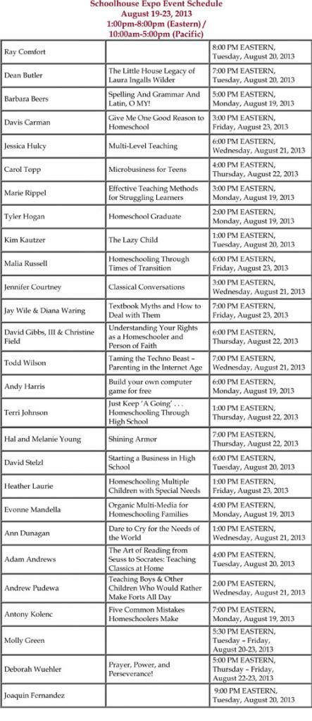
The Schoolhouse Expo runs from August 19-23 from noon to 7pm CDT.  That's 35 hours of workshops!  I'll be able to listen to the speakers on my computer and watch the accompanying Power Point presentations.  Unlike a traditional conference where it's rude to talk, I'll have a chat box to interact with other attendees or ask questions.  And I won't be chained to the computer all that time either.  The ticket price incudes  recordings of all the sessions--I'll get a link after the event is complete.


So are you starting you new homeschool year soon?  Need some inspiration?  You can register by clicking the button below.

Schoolhouse Expo

Now be sure and stop by Ozark Ramblings all week as I share 5 Days of Photoshop Elements for School.  Each day has a tutorial for using PSE and ideas for how to incorporate it in your homeschool.  I'll also be host a giveaway for a ticket to the Schoolhouse Expo and you can enter by commenting every day!

Disclaimer:  I am receiving a free ticket to the 2013 Homeschool Expo in exchange for promoting the event.

Friday, August 2, 2013

TOS Review: Legacy Documentaries


Our family’s favorite Missouri author is Laura Ingalls Wilder.   True, none of her books are set in the Show-Me State, but she spent the majority of her life here (over 60 years)  and did all of her writing here.  If you’re interested in her life beyond the Little Houses, I’d highly recommend the DVD Little House on the Prairie: The Legacy of Laura Ingalls Wilder DVD ($24.95).  It was directed by Dean Butler and produced by his company,  Legacy Documentaries .  If you grew up in my era (or you’ve watched the countless reruns still on today), you may recognize that name as the actor who played Almanzo Wilder on Little House on the Prairie. 

If you’re only familiar with Laura through the TV show I’m sorry but they strayed pretty far from reality—there was no Albert, Mary never married or taught in a blind school, it was never Laura’s dream to become a teacher (she did it to help pay for Mary’s schooling).  Even the books don’t always paint an accurate picture.  Are you ready for a shocker?  There was no such person as Nellie Oleson!   The girl we love to hate is really a composite of three girls from Laura’s childhood.   Here’s another surprise—there was another family (never mentioned in the book) that stayed with the Ingalls family during The Long Winter
.
All these facts and many more are shared on the nearly-hour long DVD.  It begins with Laura’s life during The First Four Years and continues through her arrival at Rocky Ridge farm in the Ozarks and her becoming the author of the beloved Little House series.  The focus really is on her adult years – the facts from her childhood come up as details as she writes each book.

I was thrilled to get this DVD as we prepare to attend Wilder Days in Mansfield, MO this fall.  I didn’t assign my son to watch with me (that would make it too much like school), but I did turn it on in the living room while he was playing with blocks.  He ended up leaving the blocks and joining me on the couch—so don’t think this is just for girls to watch.  Laura’s story is told through re-enacted vignettes, illustrations from the books, and panning and zooming over old photographs (think Ken Burns documentary)  while Mr. Butler narrates. Occasionally a historian or literary expert will share some insight..
wilder-composite

Let’s focus a minute on the DVD itself rather than content.  There are no closed captions.  The video is divided into chapters but there is no scene selection menu.  The bonus features have trailers for Legacy Productions two other DVDs –Pa’s Fiddle and  Almanzo Wilder: Life Before Laura.  There is also a 10 minute Director’s Diary with Mr. Butler’s reminisces  from filming the documentary.

If you’re planning a trip to Wilder Days, or any of the Little Houses, this DVD may give you more insight into the author’s life.  Better still, suggest you local library purchase a copy so everyone can learn a little more about on of America’s favorite storytellers.

Photobucket
 
Related Posts Plugin for WordPress, Blogger...