 Last August we spent five days introducing you to the idea of using Photoshop Elements in your homeschool. If you missed any of those topics, here they are:
Quick Pages for Journaling/Notebooking
Multi-Layered Templates for Recordkeeping
The Type Tool for Flashcards and Labels
BONUS Tutorial: Making shape books
Now I’m back with some more PSE projects –this time things I’m using for our study of the American Revolution. So let’s jump right back in….
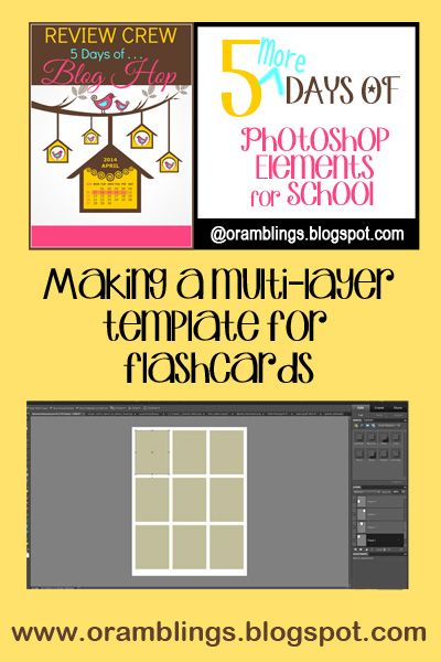
Sometimes I feel like I’ve turned into a flashcard queen, but it’s been so easy to use them in reviewing games for our history. We’ve covered explorers, colonies, and now figures of the Revolutionary Way. Today I’m going to show you how to make a multi-layer template so you can easily plug in your own text and/or photos and make flashcards. Don’t let the lingo scare you…it’s really easy.
We’ll start with a new blank file (need to review how?
Because we use flashcards for Go Fish or Memory type games, I prefer to make ours roughly the size of baseball cards (don’t know if my non-American reader’s have any comparable trading cards to relate to?). I can fit nine on a page and still be able to cut them out and stick them in a standard size laminating pouch. I cut them first and then laminate (if you laminate the entire page first and then cut, the edges aren’t sealed and begin to separate with use).
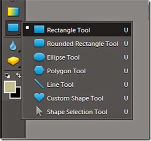
The first tool I’ll be using is the Rectangle Tool to make specified size boxes. It will be easier to view on the computer screen (certainly easier for this tutorial) if the boxes aren’t white like the background. If you haven’t changed your default foreground color, they’ll be black. I’ve changed mine to a nice tan. The rectangle Tool is one of six shape tools that are toggled from the same spot in the tool bar (third spot up from the color selector). It should be the default tool, but if you see something else right click in the corner and choose the top tool.
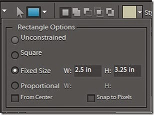
The mouse will change from an arrow to a cross shape and I could start drawing with the grid lines as my guides, but I prefer the precision of designating the size of my box. In the top left corner of the screen you should now see the blue rectangle shape repeated next to a white down arrow. Clicking on that arrow opens a new window.
Set the fixed size of your box to 2.5 inches wide by 3.25 inches high. (Note: you have a second opportunity to change the color of your boxes here).
Click your mouse close to the intersection 1/4 inch from the top and from the left edge. The box should appear and snap into the grid lines. (If it doesn’t you can switch to the Move tool and nudge the box until it does snap in place).
Now move over 1/4 inch from the last box and click again to make a new box appear. Repeat to squeeze one more box in the row.
You’ll move down 1/4 inch and create a second and then a third row. There should be 1/4 inch separating the boxes and the edges of the page with a slightly larger margin at the bottom. If you look in the Layers area of the workspace, you’ll see each rectangle shape has been added to its own layer and the thumbnail will show it’s location on the grid. (For some unknown reason the theme to the Brady Bunch is now rattling around my head).
You can turn off the grid lines and save this as a .PSD file to use for any future flashcard project. You want to keep in in this format with all the layers. Switching it to .jpg will save file space but will make it a flat image and we won’t be able to manipulate the placeholders for our pictures or text when we add them tomorrow.
In the meantime, check out some of my Crewmates’ 5 Days of … posts, or click on the graphic to see all the participating blogs.
Beth @ Acorn Hill Academy ~ Nature Study
Aurie @ Our Good Life ~ Photography Tips and Tricks
Dinah @ The Traveling Classroom ~ Tips for Learning a Second Language
Julie @ Nurturing Learning ~ Art Resources
Tara @ This Sweet Life ~ Preparing for a New School Year
Sara @ Embracing Destiny ~ Purposeful Living
Rebekah @ There Will Be a $5 Charge for Whining ~ Culinary Adventures for Boys
Hillary @ Our Homeschool Studio ~ Fitting in the Extras


3 comments:
I need to bookmark all your photoshop stuff! I am so clueless about it and based on this post, it looks like it could be so useful!
Now you've made me want to get Photoshop Elements. :-)
Beth, Photoshop Elements is a relatively inexpensive way to get into graphic arts/photo manipulation. I actually got my copy with Teacher Reward points from Office Max after purchasing school supplies.
Post a Comment