Yesterday we worked on building a template for creating our own flashcards. Today we get to move on to the fun stuff—adding pictures and facts to remember. Incidentally, these are one sided flashcards that work in pairs (1 picture/1 fact). I use them for matching up exercises or playing the Memory game. These aren’t like math flashcards where the student sees the problem on one side and the parent sees the answer on the other.
I’ve been making American Revolution flashcards so I just Google the name of the individual and “portrait” to get started. When I find an image I like I click on it to bring up a larger preview and the click on “View Image” to bring up the picture in a blank window.


When you Right-Click the image in the new window you’ll have the option to Save Picture As… I’ve got a folder saved on my computer full of Revolutionary war figures so I’ll save the image there. When I’ve got 9 of them I can complete a page of flashcards.
I go into Photoshop Elements Edit and open my flashcard template and nine images. You can see them all at the bottom in the project bin. If you can’t see all your open pictures you may need to use the slide to the right of the project bin to scroll down. First I double click on the template to bring it up into the work area and I select the Move Tool from the top left side of the screen. IMPORTANT NOTE: Before you change anything, use File>Save As and save this template under a new name (Say Revolutionary portraits page 1). That way you are not making changes to your original multi-layer template.

I click on the tan rectangle in the upper left corner –you’ll see a thin line around the shape and Shape 1 will be highlighted in the Layer box to the right. Now I’m go to click on one of the portraits for the project bin and hold the mouse button down to drag the image up to the work area.
 Whoops, what happened? You can’t see the image can you? That has to do with the order that we built the rectangular shapes. Each new shape is placed on a layer above the previous one so while we dragged our image above Shape 1 it’s place below Shape 5 (the middle). The image is there, you can see the outline of it. Since all objects dragged up are going to be placed dead center, let’s do something about this right now.
Find the layer named Shape 5 in the Layer section. Click and hold the left mouse button. You should notice the cursor changing from a pointing finger to a clenched fist. Now you can pull the layer down the screen which will in turn move it closer to the background of our multi-layer template. I put my Shape 5 right above the background layer. As you drag the Shape 5 layer down you should notice the portrait should be revealed. Now we can use the move tool to drag the portrait over the rectangle in the upper left corner.


None of the images I’ve chosen are exactly the same size as the tan rectangle I’ve created. That’s okay because I plan to use the shape as a clipping mask (See last year’s Day 2 tutorial for more details). For now all I need to do is click and drag the corner square of the portrait to make the image bigger than the tan rectangle. Then I hold the Ctrl key and tap G.

All at once the portrait is confined to the size of the tan rectangle and the portrait layer appears indented above the Shape 1 layer. I can still move and resize the portrait layer to tweak what appears in the space. This may be more evident when I work on the landscape image of Ethan Allen.

You can see the picture is far too wide. After applying the clipping mask the image looks like this…

I can still move the image around so that Ethan is in the center of the frame (look at my finished work).

If you read my post about making explorer flash cards you’ll recall I wish I had added the names to the pictures—after all I wasn’t trying to have my son be able to pick Abigail Adams out of a line up. I’ve added text to each portrait to include their name and even found a .psd file of John Hancock’s famous signature.

Now let’s briefly talk about the corresponding flashcards that will be filled with facts of these great Americans. We need to start with the blank template file (I hope you took my advice and saved your portrait project under a new name and you still have a blank template to go back to). First we’ll need the Type Tool (for more detail on changing fonts, color, and size read last year’s Day 3 tutorial).
 |  |
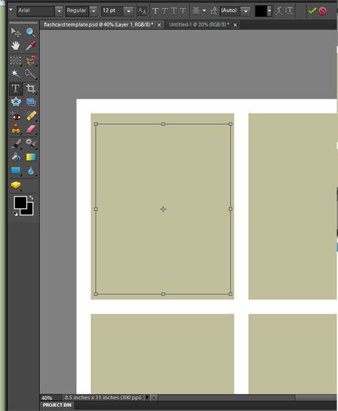
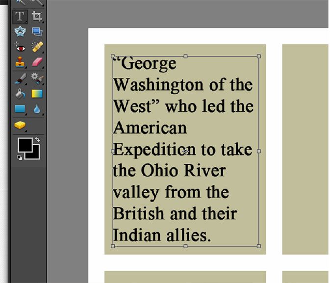
| Defined Type area | Text “wraps around” as I type |
I Click and hold the left mouse key and drag the cursor to create a box just inside the borders of the first rectangle—this will define my text area. The text will “wrap around” when I reach the edge, just like I was using a word processor. Be aware that this is NOT a word processor and won’t alert you to any misspelled words, etc.

If you’re going to print on colored cardstock, you don’t need the tan background. I used the paint bucket tool (refer to Day 1) to change everything back to white—just make sure you’re on the shape layer not the text layer. Then to see the outline of the card I switch to the Move Tool and right-click on each shape and chose Edit Layer Style from the pop up menu.

In the new window, put a checkmark in the box that says “stroke.” You can change the thickness and color of the lines to suit your tastes.
I hope you now feel comfortable with making template shapes, inserting pictures and text boxes because we’ll be doing all three tomorrow when we publish our own newspaper! In the meantime, check out some of my Crew mates 5 Days of … posts or click on the graphic to see all the participating blogs.
Beth @ Acorn Hill Academy ~ Nature Study
Aurie @ Our Good Life ~ Photography Tips and Tricks
Dinah @ The Traveling Classroom ~ Tips for Learning a Second Language
Julie @ Nurturing Learning ~ Art Resources
Tara @ This Sweet Life ~ Preparing for a New School Year
Sara @ Embracing Destiny ~ Purposeful Living
Rebekah @ There Will Be a $5 Charge for Whining ~ Culinary Adventures for Boys
Hillary @ Our Homeschool Studio ~ Fitting in the Extras


5 comments:
Excellant information and very creative, thank you for sharing this with us!
I love this tutorial, we are in DESPERATE need of our own beautiful, custom flashcards! Thank you!!
Wow! I am so non-tech it isn't even funny, thanks for the awesome tutorial! I will bookmark this so I can come back to it
What a GREAT idea!! And these can be used easily on timelines. Do you have your cards as printables?
Future Flying Saucers do you mean do I offer them as printables to my readers? I'm afraid that might violate copyright laws --that why I'm showing you how easy it is to make your own.
Post a Comment