
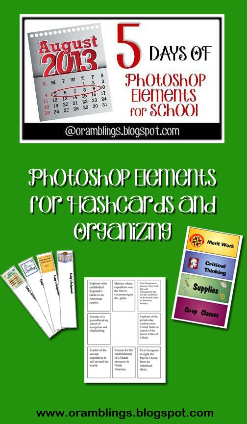
 Welcome to Hump Day in our 5 Days Of….. blog hop. As parent/teachers we know that homeschooling isn’t always great, messy experiments in the kitchen or field trips to the Children’s Museum. A lot if it is knowing which box holds the extra index cards and glue sticks or having a way for kids to know their assignments without constantly asking you “What’s next.” In the same way Photoshop Elements isn’t always altering images to make it look like I’m standing on the Great Wall of China even though I’ve never traveled to the country.
A picture may be worth a thousand words, but sometimes you just need to add words to or in place of the pictures. And believe it or not, this photo editing software can do a lot to make words pop. One word of caution—it cannot spell check or notify you of grammar errors the way a word processor can so proof read, proof read, proof read. Today we’re going to cover some of the basics of the Type tool and how we can use it to make labels and bookmarks, flash cards, etc..
The Type icon looks like a capital T in the toolbar

In most cases I simply use the Horizontal Type Tool—this allows me to type on the image from left to right just like word processing—although it will not “wrap” text when you come to the edge of the image, you must hit the enter key to start a new line. We also have access to all the fonts on the computer. With the Text tool active you can see an options bar like this.
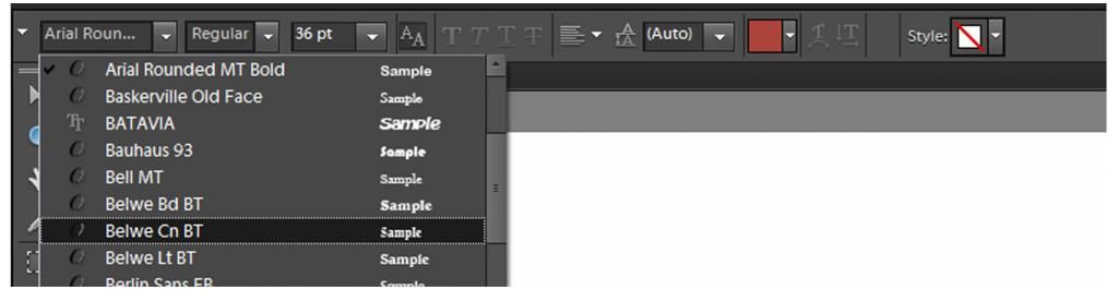
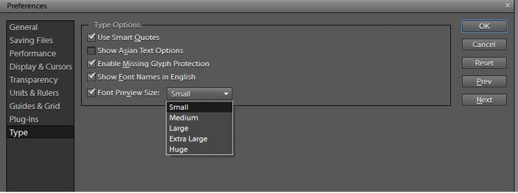
The first drop down menu allows you to select your font family. PSE has a nice feature letting you see a sample of the font next to the name but the default view (like the picture above) makes the letters so small it’s nearly impossible to tell one font from another. You can fix that by clicking Edit>Preferences>Type. When the Type Options window pops up change the Font Preview size to Extra Large or Huge if you need it and click OK.
The second drop down menu allows you to select different styles of your font family—condensing the letters, adding italics or boldness. The default will say “Regular.”
 Not all fonts have these styles available but you may still be able alter their appearance with the Faux buttons (all with the letter T in different styles). If the font family you’ve selected doesn’t come with bold type or italics, Photoshop Elements can create a fake one for you.
 The third drop down menu is font size. Pick something you believe is close to your needs, but you can always make your text larger or smaller by switching to the move tool and dragging at the corners of the text layer.
The box with the two A’s has to do with keeping the letters from looking too pixelated at larger sizes. It’s official name is Anti-Aliased. The default setting is on. Do yourself a favor and leave it that way. The next drop down menu with the lines lets you pick left, center, or right justification of your text. The icon with the two A’s on top of one another let’s you select the spacing between lines of text.
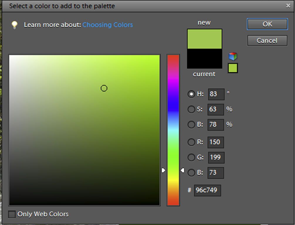
The last icon we’re going to worry about today is the color box. Click the down arrow once and you’ll see a selection of standard colors.
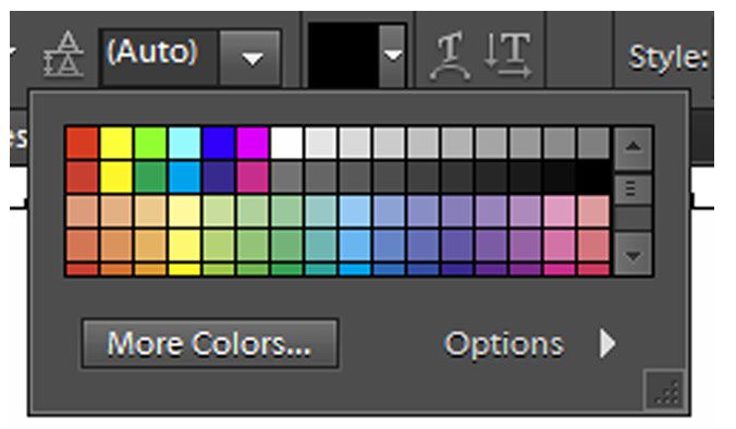
Click on the box that says more colors and a new window opens.

Now let’s see some type tools in action. This week I’ve been making flash cards for our upcoming history lessons. I start with a blank new file 2.75 X 3.5 inches in size. I’m going to use the horizontal type tool, but I don’t want the words to scroll off the page in a straight line. After selecting the type tool, but before I begin typing I click and drag the mouse from the top left corner to the bottom right corner over the white background. This creates a bounding box so what I type will automatically wrap around to a new line when it reaches the edge. You can choose if you want the text justified to the left, right or centered in the box.
After I typed the historical information in, I dragged this the thumbnail of this box onto a larger 8.5 X 11 background. Doing this makes PSE treat it as an image not a text box so I won’t be able to edit what I’ve written. I move the box where I want it on the page and I outline it by choosing Edit>Stroke (Outline) Selection. I can fit 9 flash cards on a page (notice that I kept the center open till last because images dragged onto files always appear dead center).

In this particular case, I’m making flashcards for a Memory type matching game so the other side will remain blank. If I wanted to put the portraits on the reverse side I would flip my image over Image>Rotate>Flip Horizontal to ensure an exact mirror image when printing and then I would arrange the pictures over the backwards text.
Let me show you some of my other projects where Text features a prominent role.

We organize our school materials in Workboxes, but rather than label them with numbers I keep one specifically for every subject with a spare one for pencils, glue sticks, index cards etc.
I begin with the Shape tool to make rectangles and fill it with Gradient tool color (I can see I’ve got more than 5 days worth of Photoshop Elements to share—maybe I’ll start a weekly tutorial). Then I added my pictures and text.
Normal fonts can only get so big before they start to appear pixelated. If you need really big letters you may want to try an Alpha set. In this case each letter is it’s own high resolution .psd file and you can resize it just like a picture without it appearing to blocky. (There’s another future tutorial).

I always make a set of bookmarks for each subject as well. Not only does it help us find our place in each book, each day but I laminated them so I can write each day’s assignment on them in case I’m not available when my son finishes one subject and is ready to move onto the next.
Although the words appear down the length of the side, this is not an example of Vertical Type. I typed the words “Today’s Assignment” using the same Horizontal Type tool and the rotated the words with the Move tool.
We’ve just scratched the surface of the Type tool. Adding text on a shape or following a custom path (a new feature of PSE 10 and above) helps make great mini-books for lapbooking. Speaking of lapbooks, that’s the subject of tomorrow’s tutorial so you’ll want to check it out. Have you learned anything new this week? Do you have any ideas for future tutorials? Leave a comment.
Click on the image below to see what other Crew Members are sharing.

1 comment:
Never seen a better tutorial on Photoshopping, I hope there is more...
Post a Comment